
Project Overview
My Role: Visual & UX Designer.
The product: This is a personal project inspired by my recent visit to Disney. During my trip, I encountered some usability challenges with the official Disney app, which sparked my curiosity and passion for enhancing user experiences.
As much of my professional work is bound by non-disclosure agreements (NDAs), this project serves as a tangible example of my skills and expertise in user interface and user experience design.
Upon opening the Disneyland app, I identified 3 main pain points.

2
Navigation
The app’s bottom navigation suffers from a lack of visual cohesion, employing a mishmash of rounded icons with straight edges. Additionally, the implementation of a floating action button that overlays a menu instead of guiding users to a specific screen disrupts the expected navigation flow.

Simplifying the
Ticketing Experience
My first priority was to simplify the ticket-purchasing process. Instead of the immediate promotion of the Disney Genie + service, I advocated for a more user-centric approach. Users should have easy access to purchasing park tickets without being bombarded with upsells. Furthermore, acknowledging the global user base, I addressed the issue of non-US and non-Canada residents not being able to use certain features.
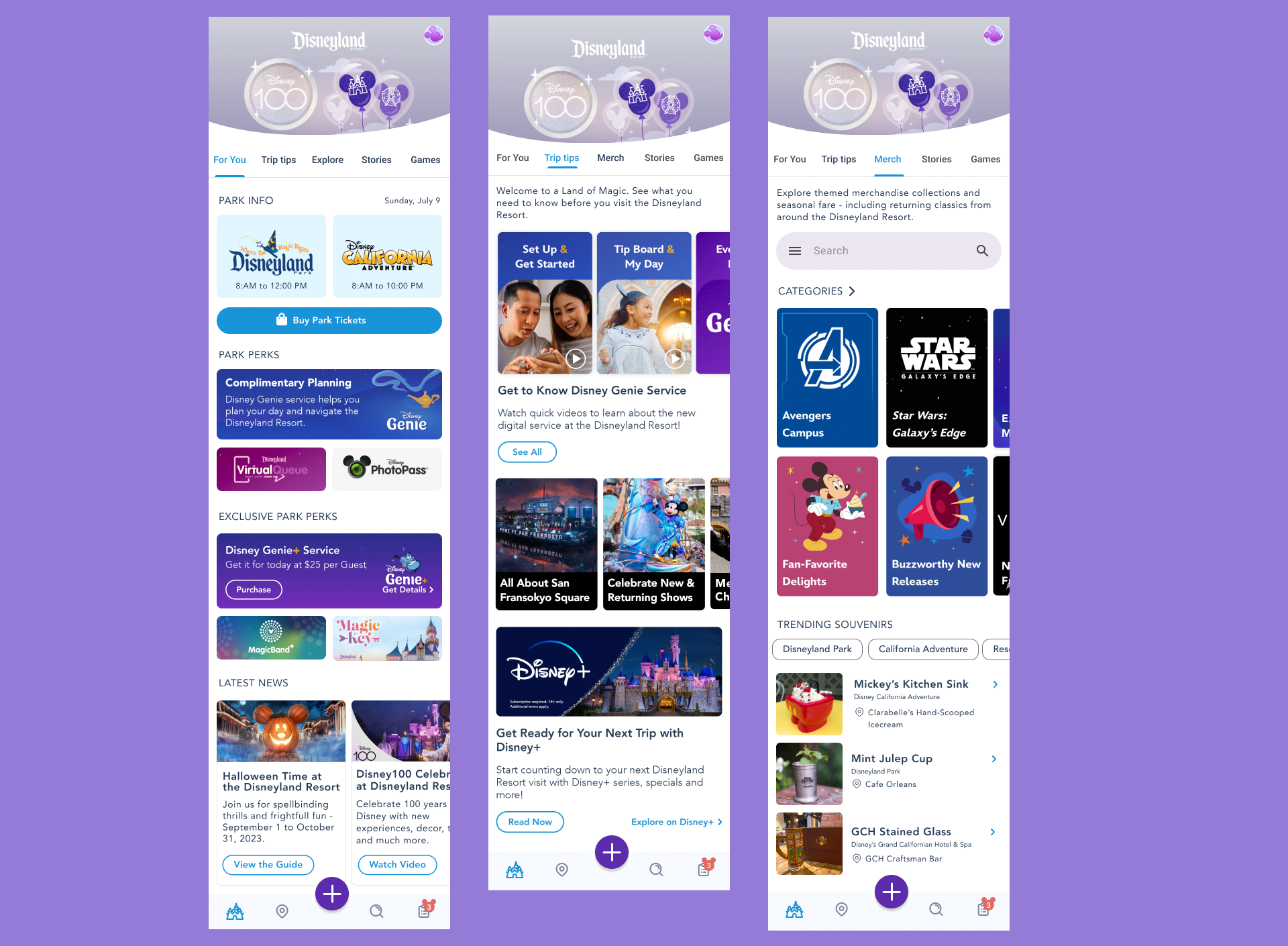
Redesigned main screen
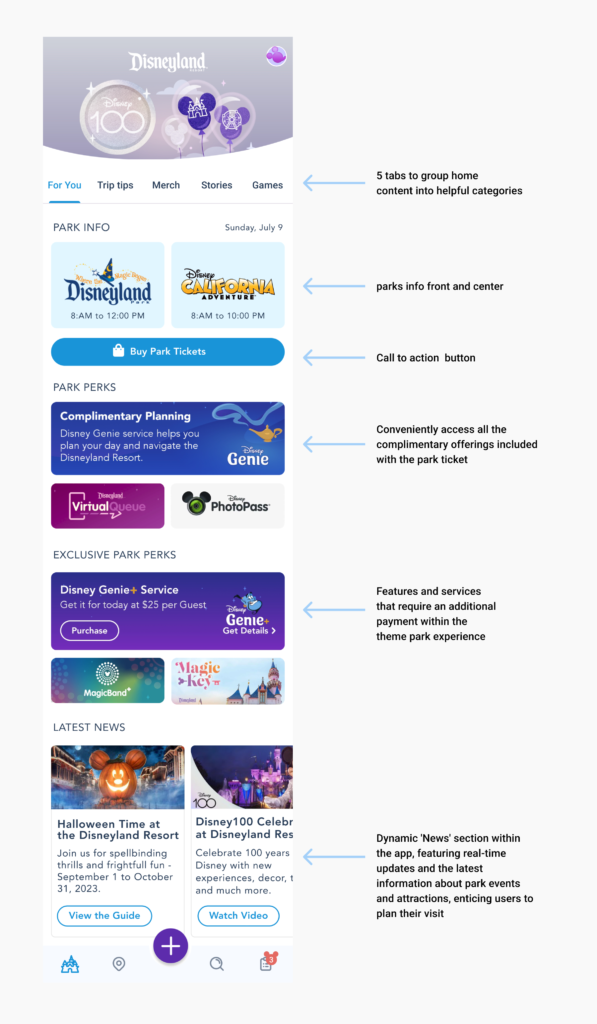
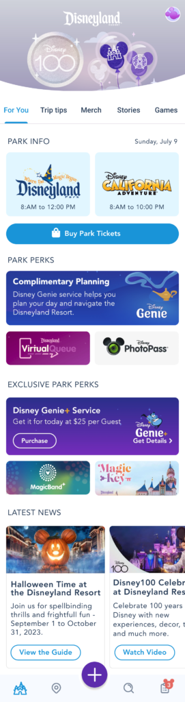
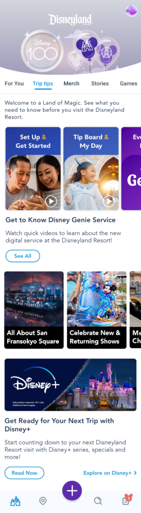
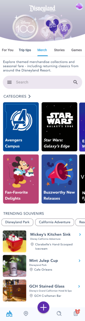
Instead of requiring users to navigate a lengthy and cumbersome homepage, I’ve introduced five distinct tabs: ‘For You,’ ‘Trip Tips,’ ‘Merch,’ ‘Stories,’ and ‘Games.’
On the main ‘For You’ tab, at the very top, users will find essential park information along with a prominent call-to-action button for ticket purchases, maintaining visual continuity with the existing app’s blue color scheme.
Directly below, I’ve created a ‘Park Perks’ section, providing users with easy access to information about complimentary offerings available within the app. Following that, there’s a dedicated section showcasing additional enhancements for a more immersive park experience, such as ‘Disney Genie Plus,’ ‘Magic Bands,’ and ‘Magic Key.’
Navigation
- Rounded Icons
- New Designs
- Floating Action Button
Icons
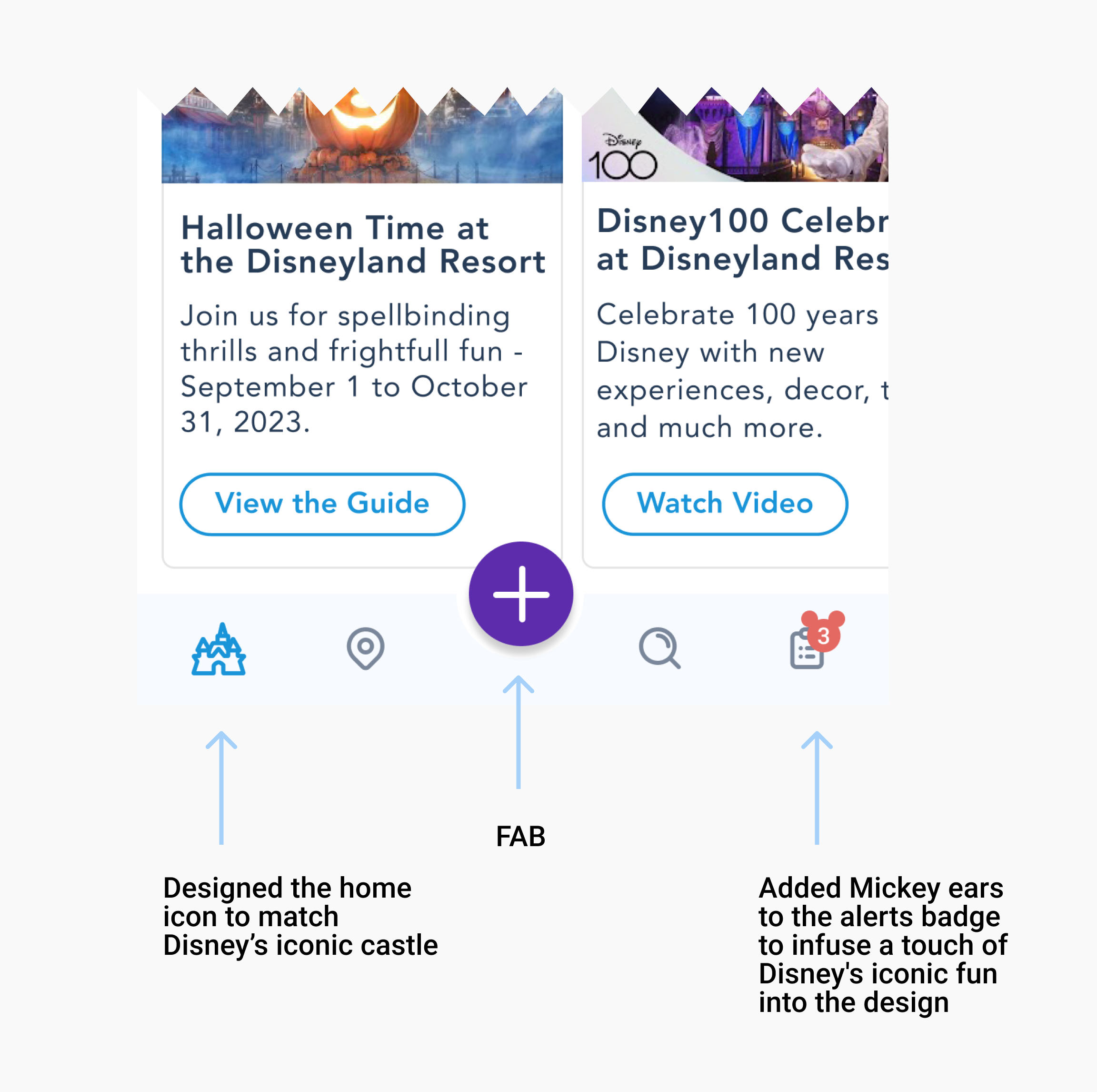
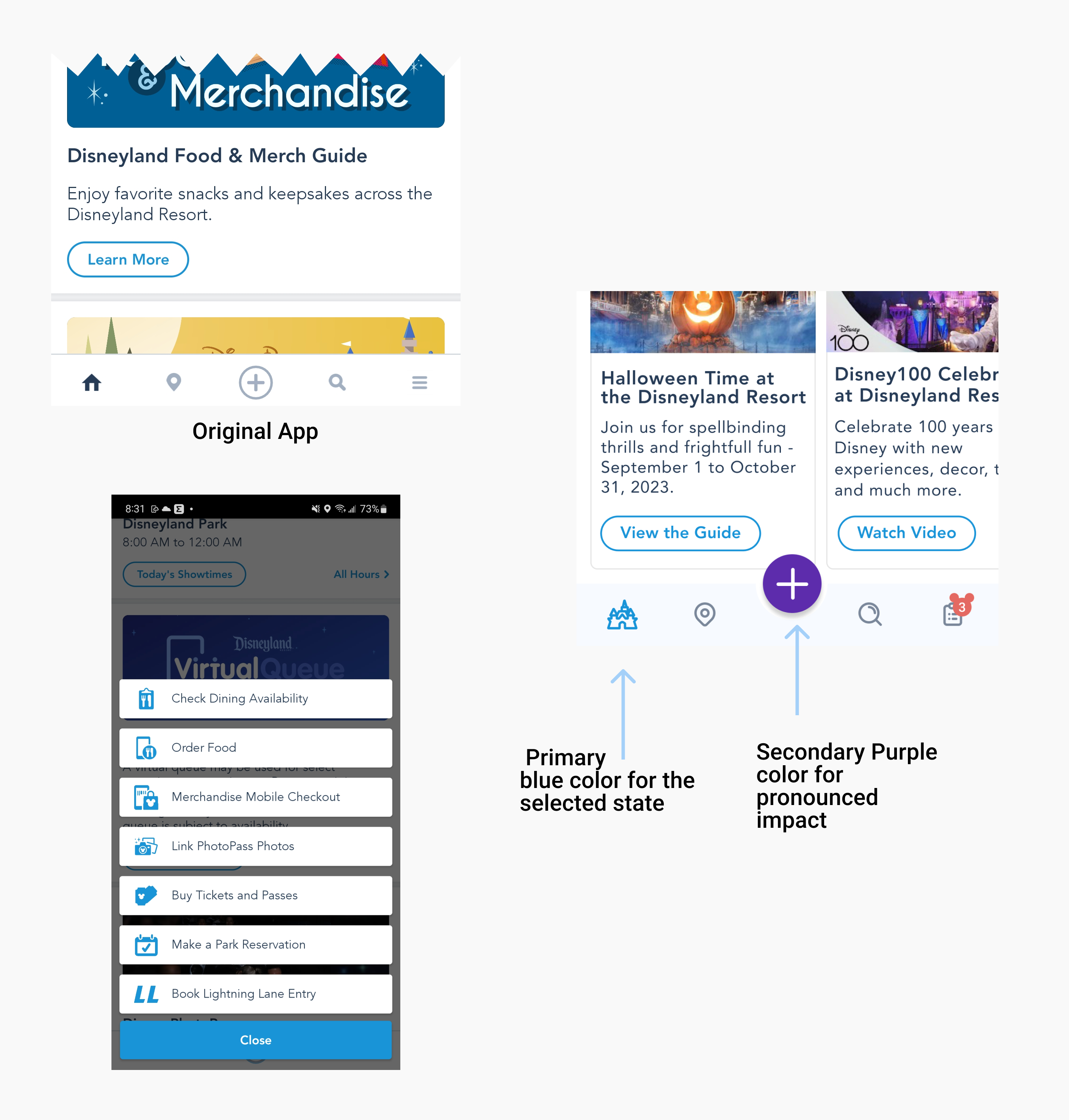
I added Mickey ears to the alerts badge to infuse a touch of Disney’s iconic fun into the design. Additionally, I ensured that all icons featured rounded corners to create a cohesive and visually pleasing aesthetic
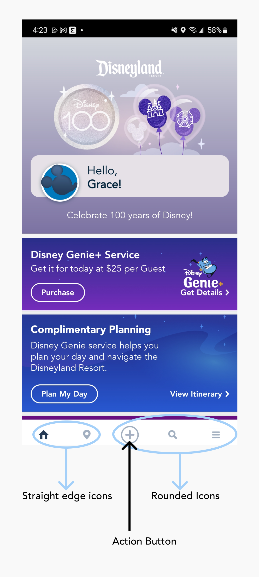
Floating Action Button
I also implemented a custom floating action button (FAB) as part of the app’s navigation, strategically setting it apart from the other four primary navigation icons: Home, Location, Search, and Journey. This separation serves a dual purpose. Firstly, it distinguishes the FAB from the rest, as it triggers an overlay navigation menu rather than directly leading to a screen, providing a clear distinction in user interaction. Secondly, this design choice emphasizes the importance and distinct nature of the FAB’s function within the app’s navigation flow, ensuring a seamless and intuitive user experience
Refining
the design
Mockups
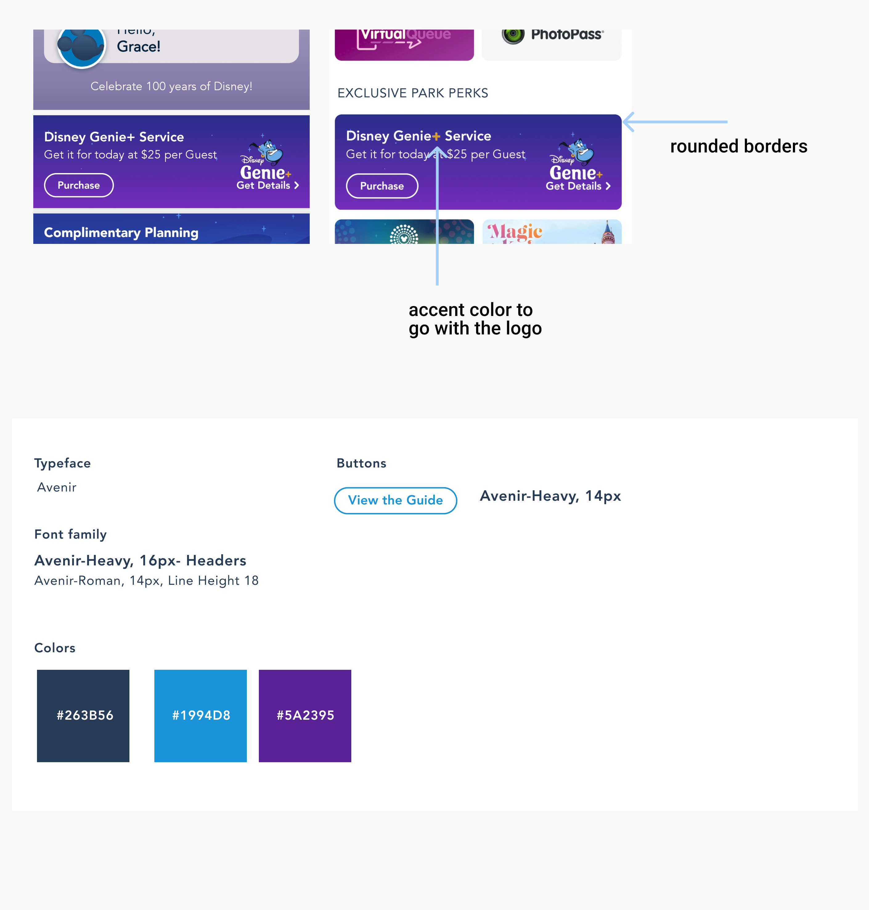
In the realm of visual design, I opted for a consistent and harmonious aesthetic by employing the Avenir typeface throughout the app. To enhance the overall look and feel, I introduced rounded borders for images and cards, contributing to a softer and more inviting visual language. Ensuring that typography and color choices remained consistent across the app, I aimed to create a cohesive and visually appealing user experience
Mockups: Original screen size
Going Forward
the design
- Takeaways
- Next steps
Impact
I shared my design with some friends who said that the design was intuitive to navigate through, more engaging with the images, and demonstrated a clear visual hierarchy.
What I learned:
I learned that even a small design change can have a huge impact on the user experience. The most important takeaway for me is to always focus on the real needs of the user when coming up with design ideas and solutions.