Project Overview
Role: UX designer leading the app and responsive website design from conception to delivery.
Duration: December 2022
Responsibilities: Conducting interviews, paper and digital wireframing, low and high-fidelity prototyping, conducting usability studies, accounting for accessibility, determining information architecture, and responsive design.
WaterRoot is an organization focused on sustainability that needed a digital platform to help the community water trees and plants. The platform is aimed at college students and adults who are concerned about the climate crisis and want to help create greener communities.
Understanding
the user
- User research
- Personas
- Problem statements
- Competitive audit
- Ideation
User research: summary
Using WaterRoots’ data on trees, I developed interview questions and conducted user interviews. Most participants expressed concern about trees dying from lack of water but didn’t take action. However, research findings indicated that users would be willing to help water public trees and plants if they had access to a simple, user-friendly tool.
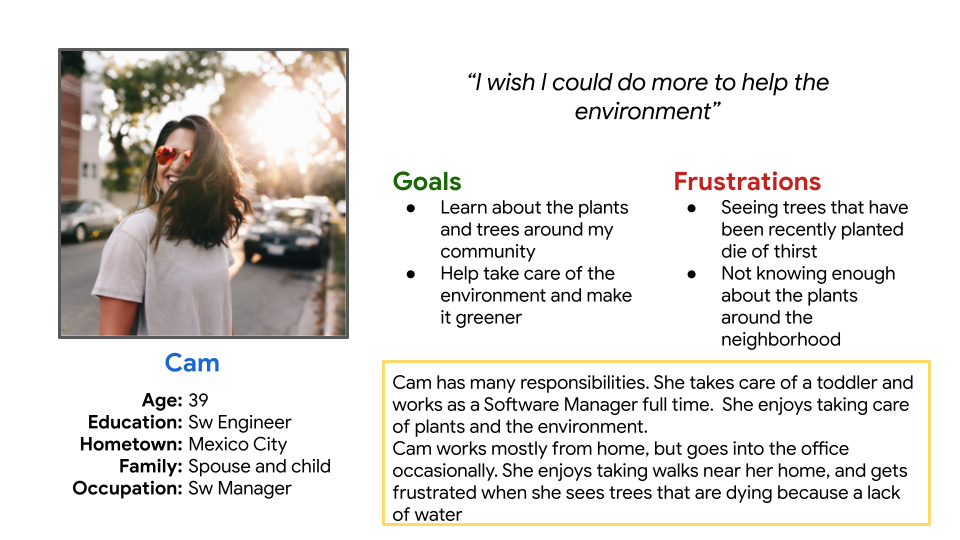
Persona: Cam
Problem statement
Cam is a working mother who wants to help take care of the environment, she gets frustrated when trees around her neighbourhood die of thirst.
Competitive Audit
An audit of a few competitor’s products provided direction on gaps and opportunities to address with the WaterRoot app.


Ideation
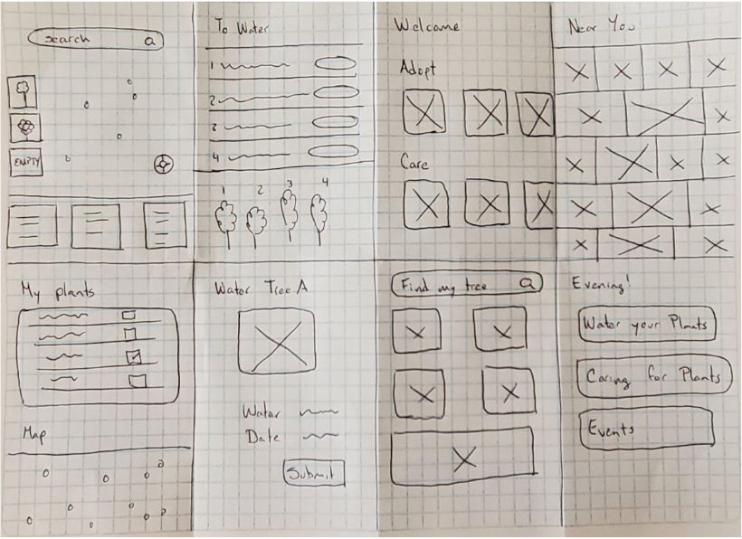
I did a quick ideation exercise to generate ideas for addressing gaps identified in the competitive audit, focusing specifically on plant watering and map location. While this was my initial priority, I later expanded the design to include key sections like Feed, Tasks, Community, and Profile to create a more engaging and holistic user experience.
Starting
the design
- Digital wireframes
- Low-fidelity prototype
- Usability studies
Digital wireframes
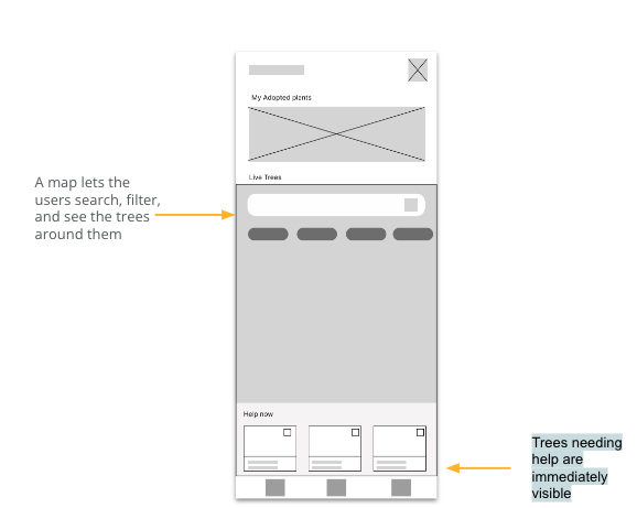
After ideating and drafting some paper wireframes, I created the initial designs for the WaterRoot app. These designs focused on delivering personalized guidance to users to help water plants in their communities.
Low fidelity prototype
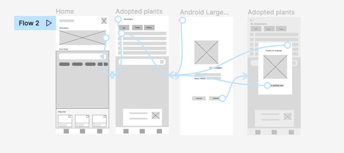
To prepare for usability testing, I created a low-fidelity prototype that connected the user flow of viewing an item about to expire and using it in a recipe.
Refining
the design
- Mockups
- High-fidelity prototype
- Accessibility
Mockups
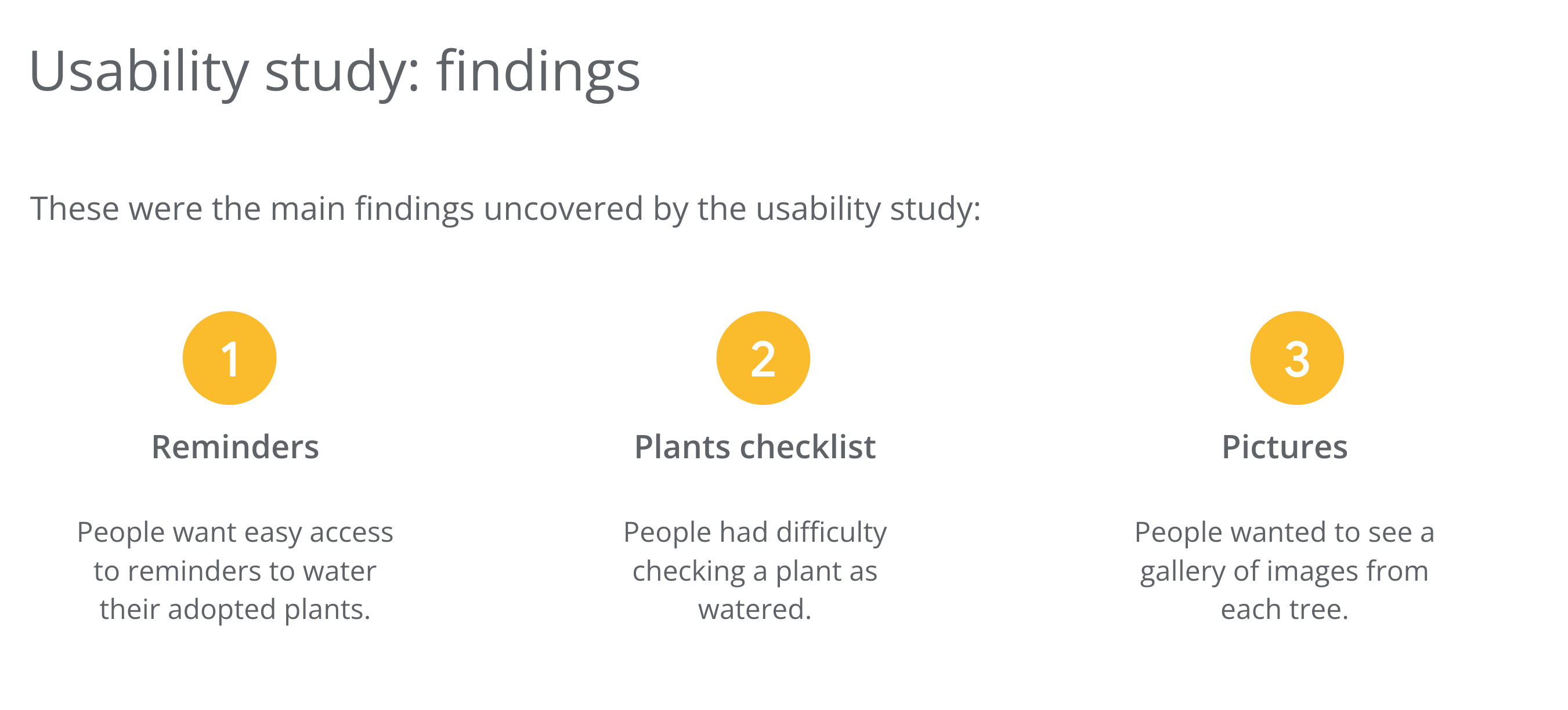
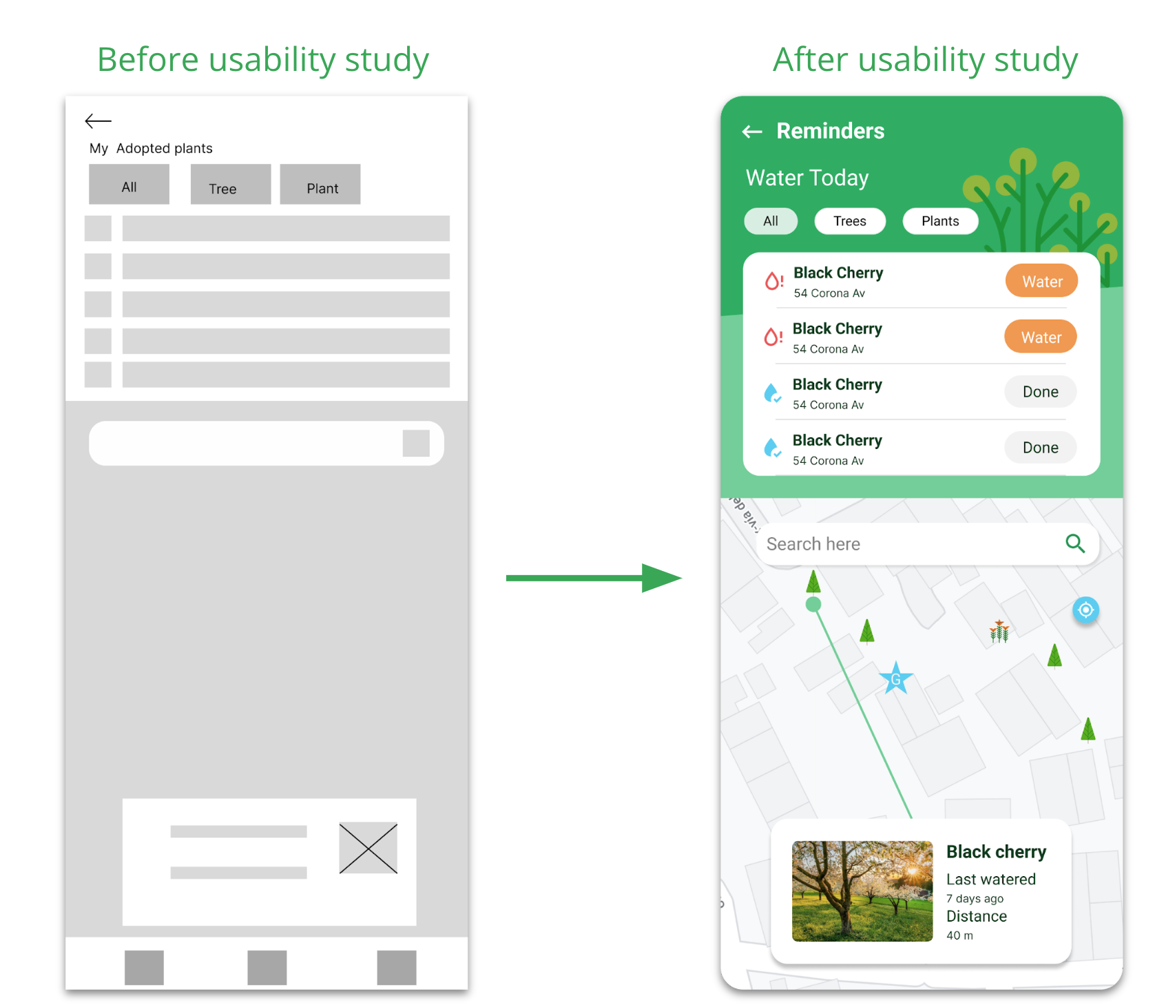
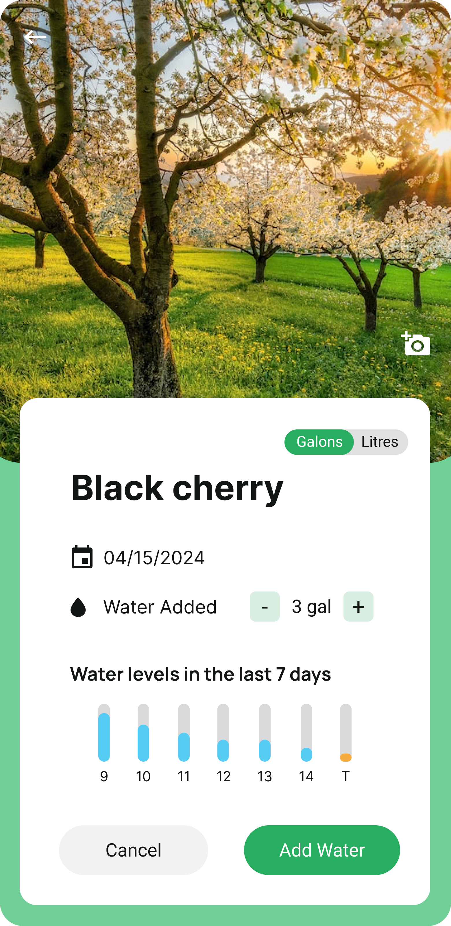
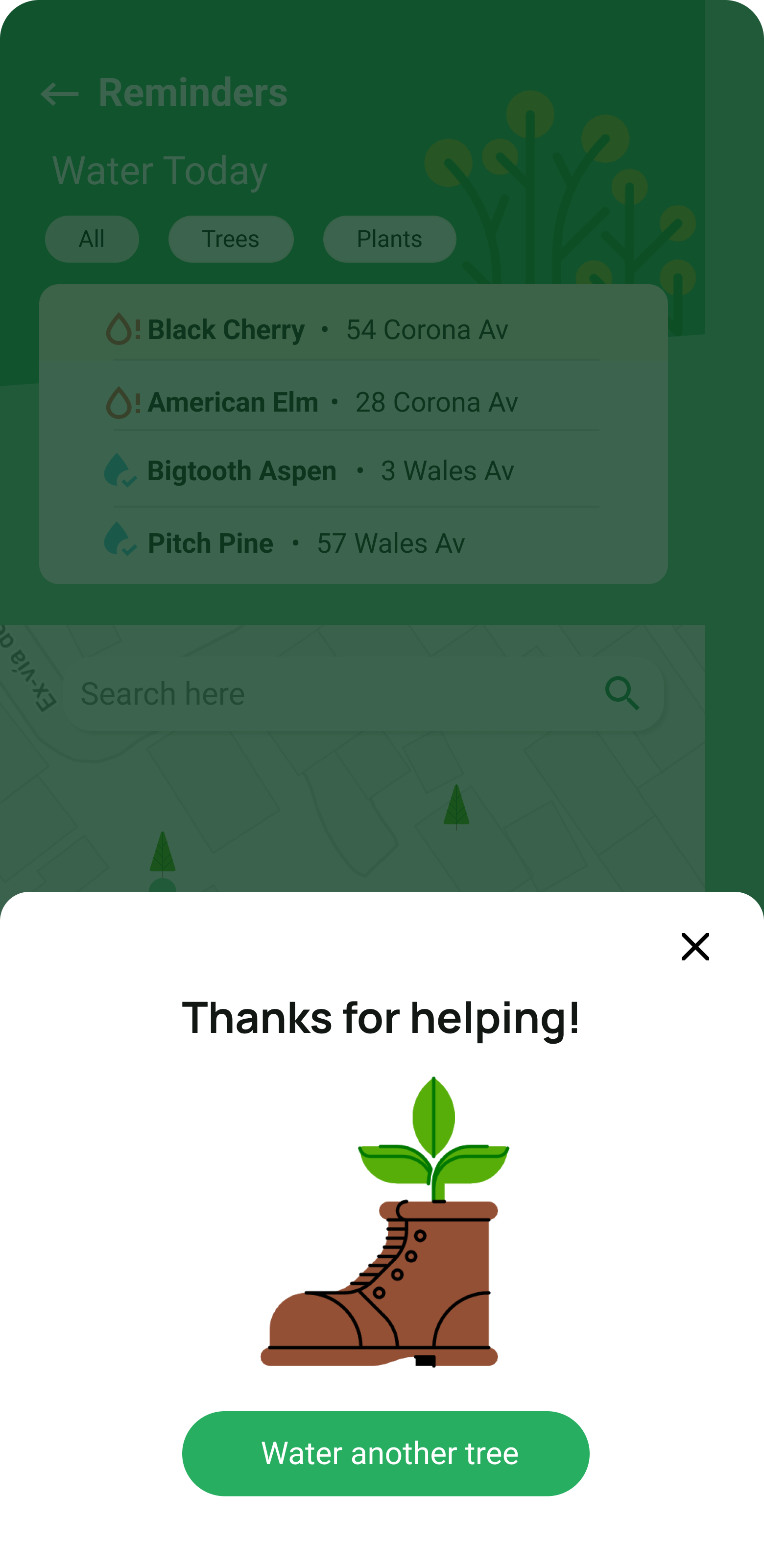
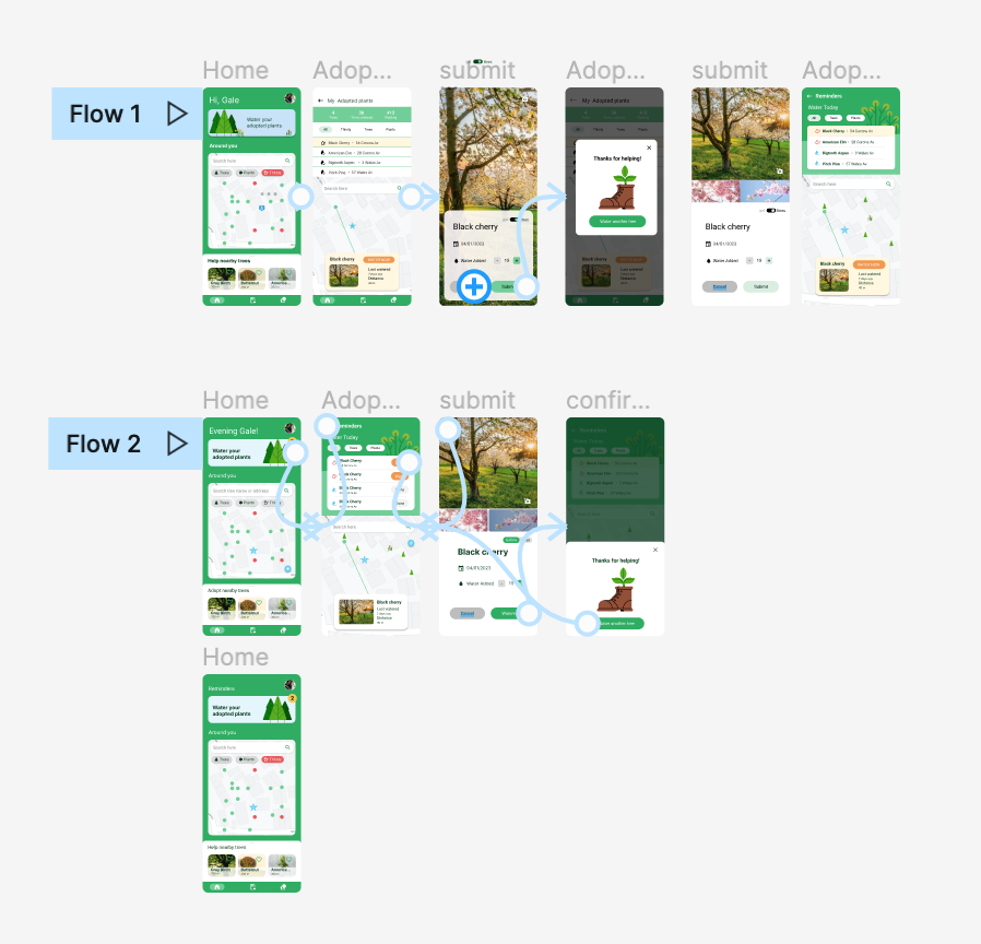
Based on the insights from the usability studies, I applied design changes like creating a reminders dedicated screen and providing a clear flow to marking a plant as watered.
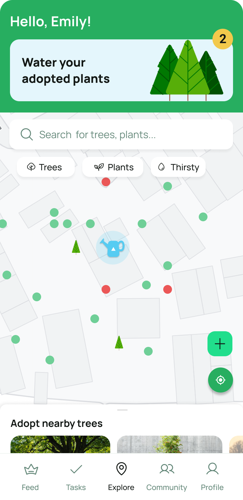
Explore Flow: High-Fidelity Mockups for Watering Adopted Plants
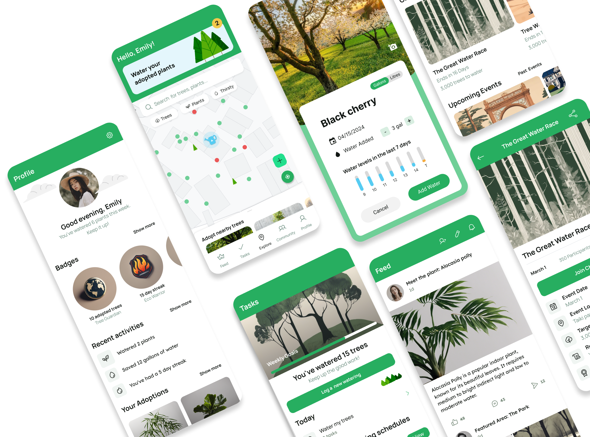
The following mockups highlight the Explore section , the heart of the app, where users land upon opening. Featuring an interactive map, Explore allows users to discover nearby plants and trees in need, filter by type, and quickly access their daily watering tasks. Designed for effortless navigation, this section encourages users to take action while staying connected to their green initiatives.
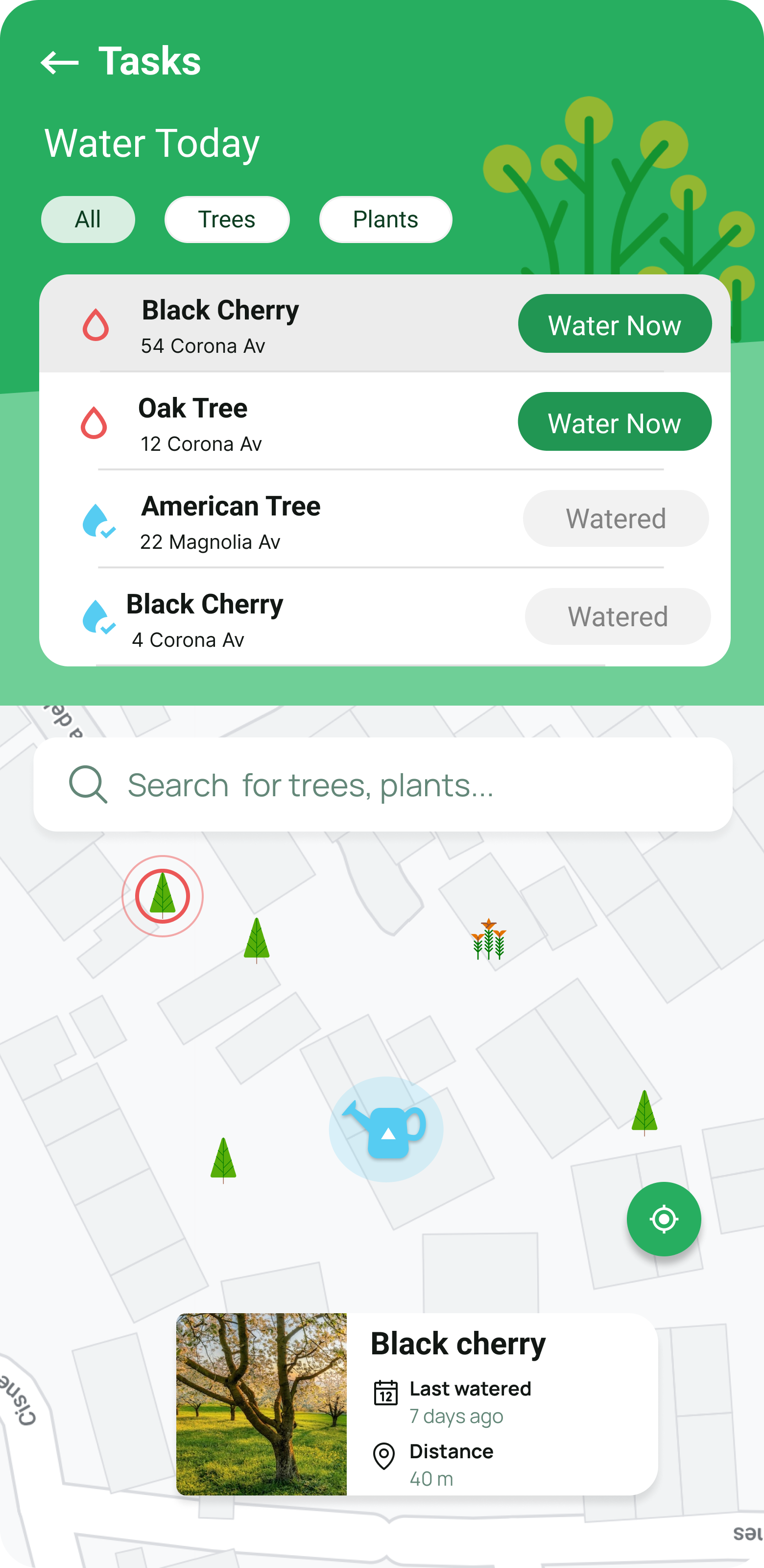
App Experience Overview: Feed, Tasks, Community, and Profile
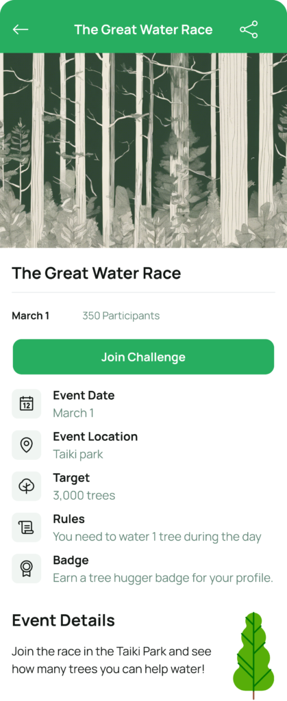
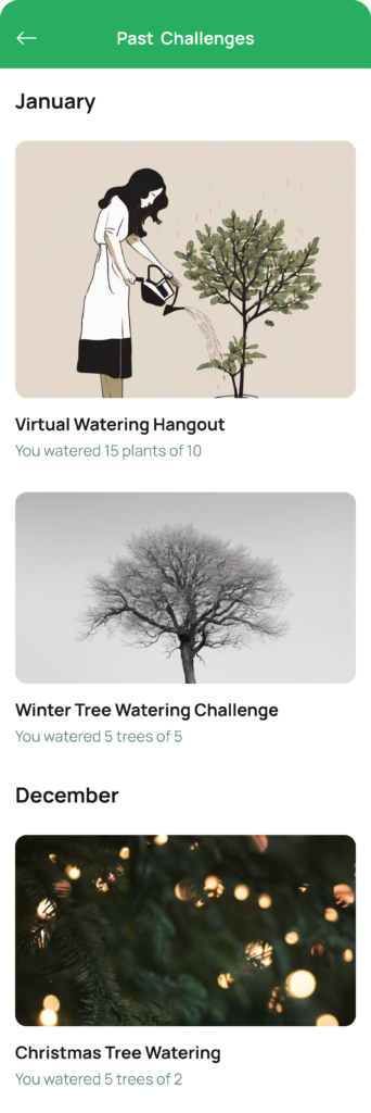
These high-fidelity mockups showcase key parts of the app experience. Feed connects users through posts and friendships, Tasks tracks watering goals, Community fosters engagement with challenges and events, and Profile highlights user impact with badges and adopted plants—all designed to make caring for the environment simple and rewarding.



High-fidelity prototype
The high-fidelity prototype followed the same user flow as the low-fidelity prototype, including design changes made after the usability study.
Responsive Design
- Information architecture
- Responsive design
Sitemap
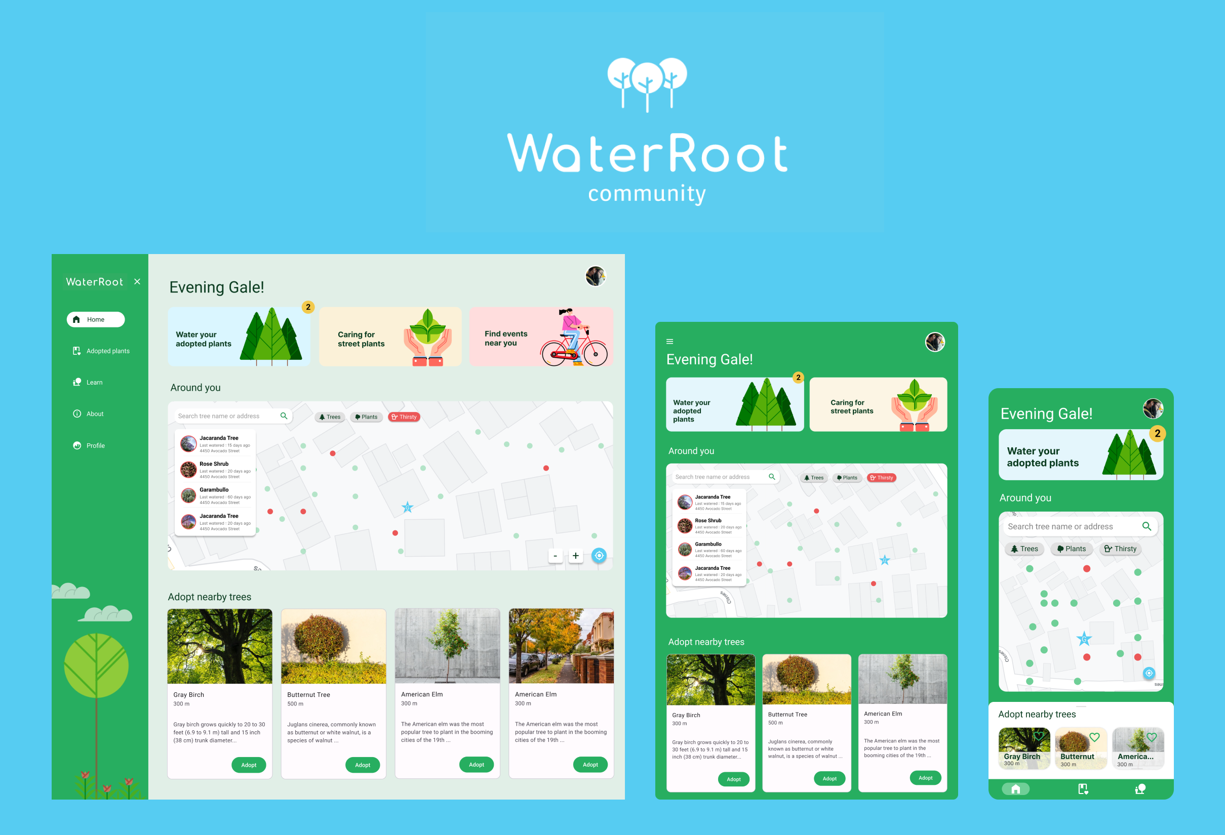
With the app designs completed, I started work on designing the responsive website. I used the WaterRoot sitemap to guide the organizational structure of each screen’s design to ensure a cohesive and consistent experience across devices.

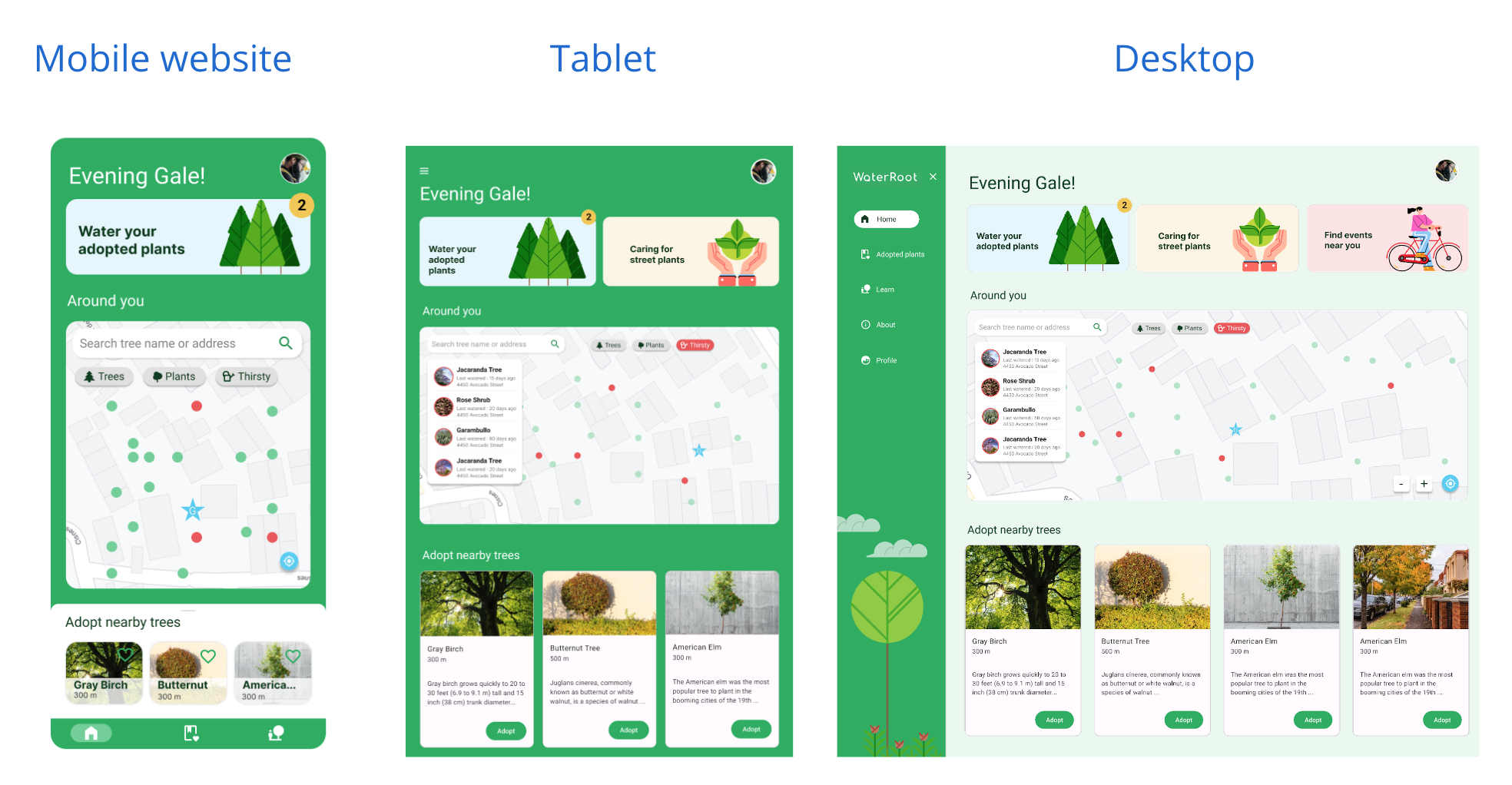
Responsive Designs
The designs for screen size variation included mobile, tablet, and desktop. I optimized the designs to fit specific user needs of each device and screen size.
Going Forward
the design
- Takeaways
- Next steps
Impact
Users shared that the app made them aware of their environment and motivated to help. One quote from peer feedback was that “the WaterRoot app helps bring caring about the environment to a personal level in a way that’s easy and engaging.”
What I learned:
I learned that even though the problem I was trying to solve was a big one, diligently going through each step of the design process and aligning with specific user needs helped me come up with solutions that were both feasible and useful. .
